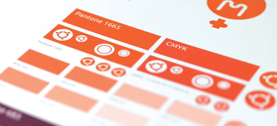
Colour is an effective, powerful and instantly recognisable medium for visual communications. To convey the brand personality and brand values, there is a sophisticated colour palette.
We have introduced a palette which includes both a fresh, lively orange, and a rich, mature aubergine. The use of aubergine indicates commercial involvement, while orange is a signal of community engagement.
These colours are used widely in the brand communications, to convey the precise, reliable and free personality.
The Ubuntu colour palette has been created to reflect the spirit of our brand. Orange for a community feel. White for a clean, fresh and light feel.
Black is used in some versions of the brandmark for flexibility of application and where print restrictions apply. It can also be used for body copy.
HEX #E95420
C0 M79 Y100 K0 (Pantone 1665)
HEX #FFFFFF
C0 M0 Y0 K0
HEX #000000
C0 M0 Y0 K100
Information: Pantone Matching System is a worldwide printing, publishing and packaging language for the selection, marketing and control of colour. PANTONE® is a registered trademark of Pantone Inc.
In addition, there is a supporting colour palette for when communications have a consumer or enterprise focus.
HEX #77216F
C60 M100 Y15 K5
Pantone 512
HEX #5E2750
C70 M100 Y50 K20
Pantone 511
HEX #2C001E
C66 M98 Y21 K85
Pantone 7449
For balance. The addition of warm grey softens the combination of orange and aubergine and provides a bridge between the two.
Warm grey can be used for; backgrounds, graphics, dot patterns, charts and diagrams. It can also be used for large size text.
For typography, particularly body copy. Black can be quite harsh in combination with aubergine, but grey delivers more balance while still being legible.
Cool grey can also be used within charts and diagrams.
HEX #AEA79F
C0 M5 Y10 K29
Pantone Warm Grey 5
HEX #333333
C44 M34 Y22 K78
Pantone Cool Grey 11
HEX #111111
C0 M0 Y0 K93
Pantone Black 2 2X
Text grey is used for small size headings, sub-headings and body copy text only.
The Canonical colour palette has been created to reflect the spirit of our brand. Aubergine for a smart, focussed feel. White for a clean, fresh and light feel.

HEX #772953
C26 M99 Y12 K52
Pantone 683

HEX #FFFFFF
C0 M0 Y0 K0
100%#E95420
100%#772953
100%#77216F
100%#5E2750
100%#2C001E
100%#AEA79F
Tints of the above palette colours can be used as background colours and in charts and diagrams when a clear visual hierarchy of information is needed.
Use only the percentages shown on this page. Never use a tint less than 10%.

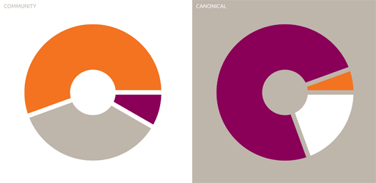
Our colour palette consists of orange, aubergine, white and warm grey. The amount of colour we use for community and Canonical collateral varies according to the emphasis of the content.
At one end of the scale, where the work is dominated by the community, the emphasis is on a fresh palette, the use of white and orange, and warm grey for balance. Aubergine is used only as a highlight.
At the other end of the scale, where the work is more focused on Canonical, the palette is more refined and grounded, with much more emphasis on aubergine as the core colour. Orange is only used as a highlight and we use white and warm grey to complement the orange and aubergine.